NTU PACE Website Redesign
August 2025 - November 2025
Product Designer (Team of 3)
User research, Competitive analysis, Information architecture, Wireframes, High-fidelity prototypes, Usability testing
Figma, Figma Make, Card sorting, Maze
The Problem
NTU PACE attracts more than 268,000 visitors/year, but 75% leave without exploring courses.
Why?
Users couldn’t find what they needed fast enough.
-
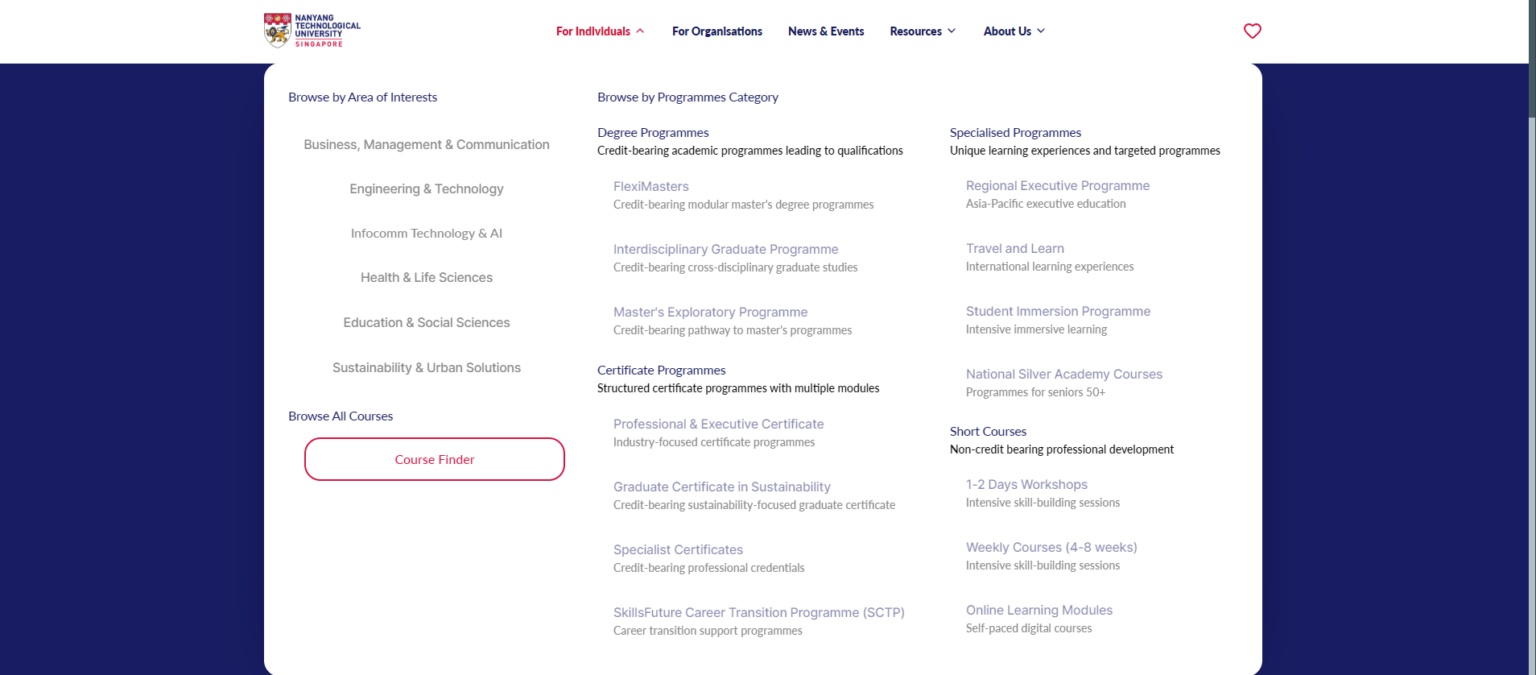
Confusing labels
11/12 interviewees struggled with terms like “FlexiMasters,” “Stackable Certificates,” “Professional Executive Certificates”
"I don't know what all these categories mean."
– M, Aerospace Engineer
- Poor navigation
>50% interviewees couldn’t find course info quickly; critical details buried below the fold - Users think in outcomes, not categories
People search by goals and constraints, not institutional structures - No way to save progress
Users gave up after leaving the site because they couldn’t remember which courses they liked
Design Solutions
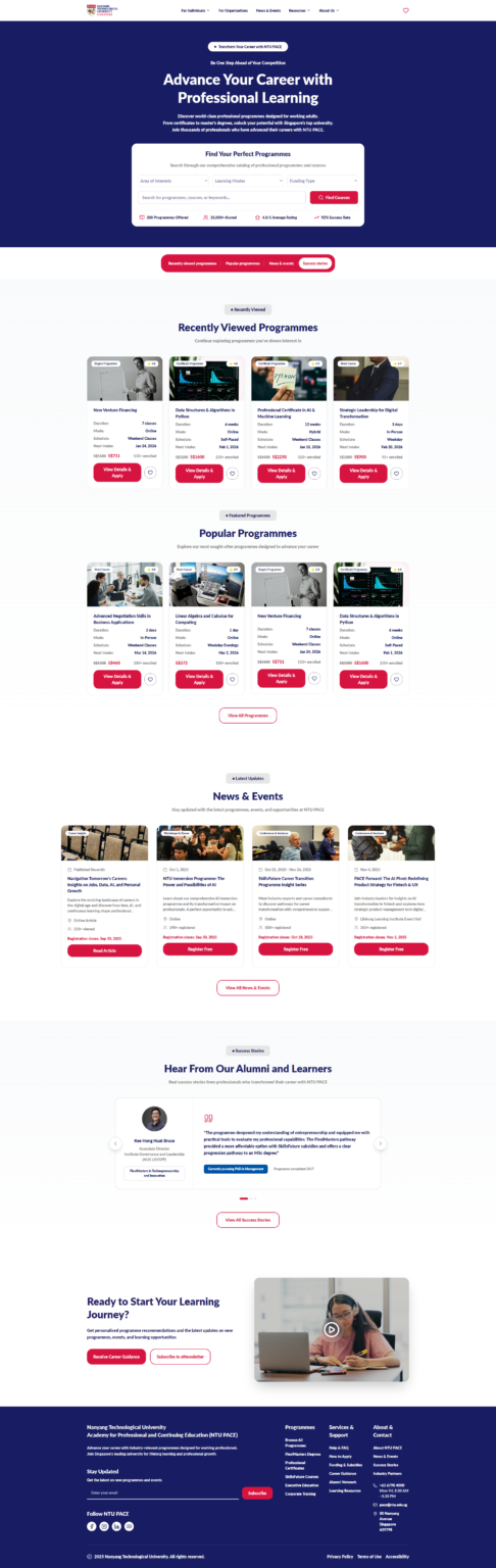
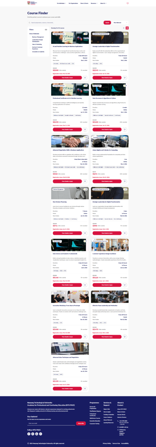
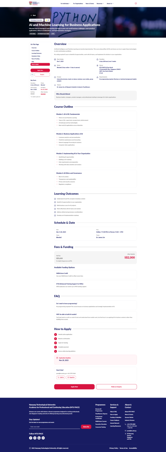
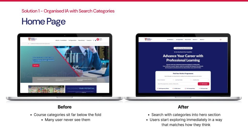
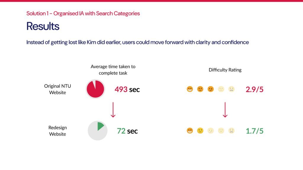
Reorganised Information Architecture with Smart Search
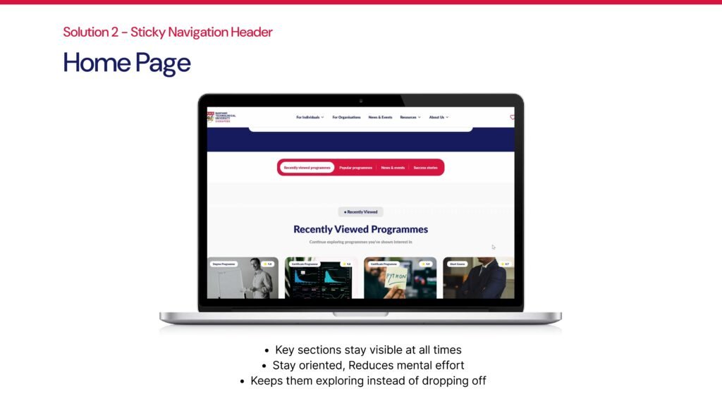
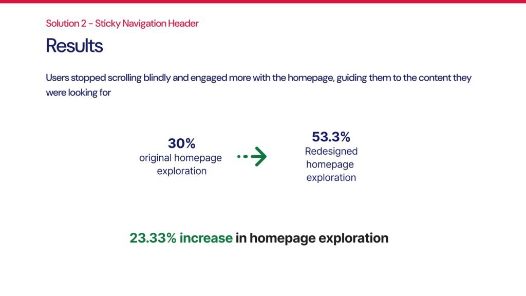
Sticky Navigation Header
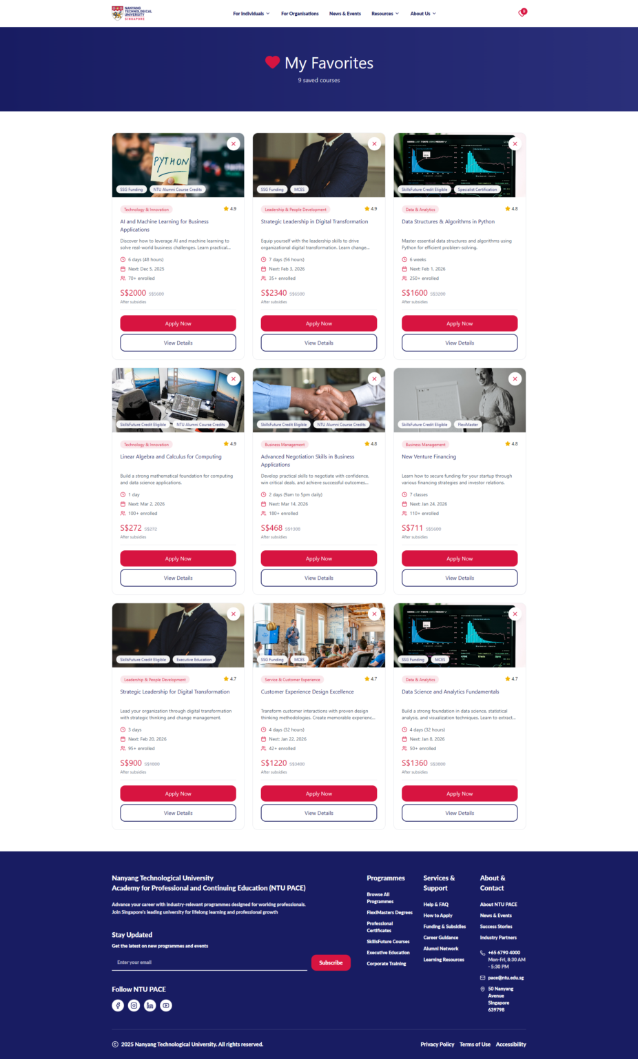
Saved Courses Feature
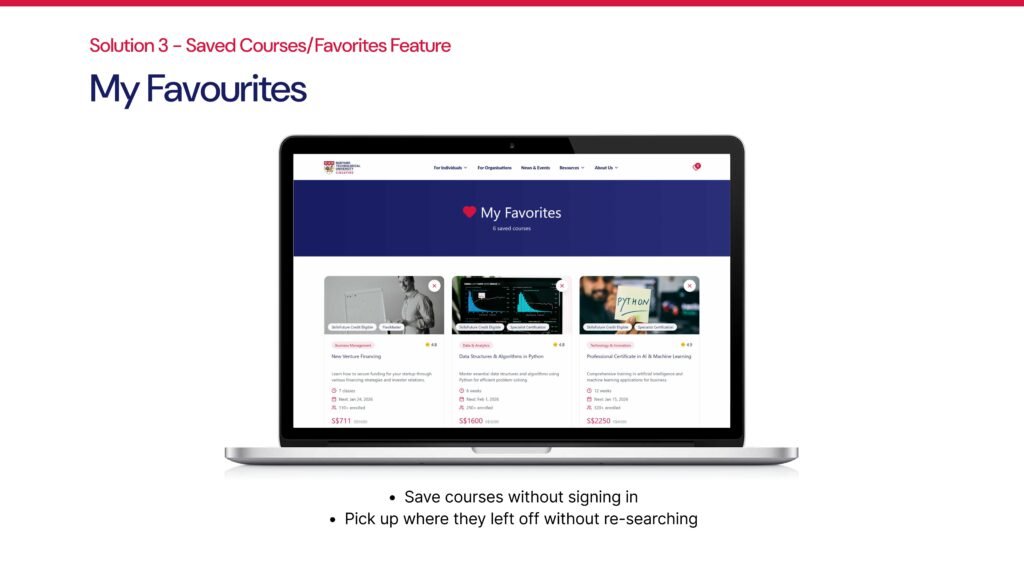
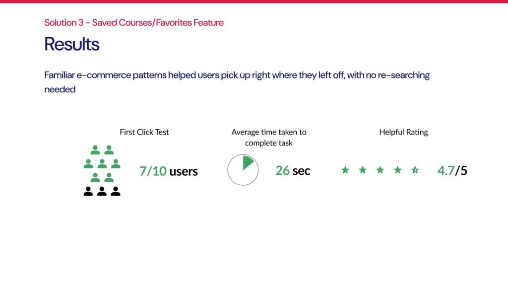
Familiar e-commerce pattern: save courses without signing in, pick up where you left off.
Business Impact
Recovering 5–10% of lost visitors = 10,000–20,000 learners
At 1–3% conversion = 100–600 additional enrolments/year
Estimated revenue: $200K–$1.2M/year
Outcomes
Vibe-coded an MVP Prototype made with Figma Make
Presented research findings, design recommendations, and interactive prototype to NTU PACE executives.
From frustration to flow: Clearer navigation. Faster wayfinding. More confident learners.
What I Learned
-
Simplifying complexity without losing depth requires ruthless prioritisation
-
Card sorting revealed real user mental models that institutional teams overlooked
-
Designing for both exploration (browsing) and efficiency (goal-driven search) requires different entry points